There was a time in my career when we'd roll out a shiny new interface and hope for the best. We'd have standups where someone might say, "It feels better," or "I think this flow is smoother," and we'd all nod as if that meant something.
I remember one project where we'd redesigned a key section of the app. It looked better. We had cleaner visuals and fewer steps. We shipped it, celebrated, and waited for the praise to come in. A few days later, the product manager appeared with fresh analytics and a concerned look. "So, did this actually help users? Because our support tickets just went up."
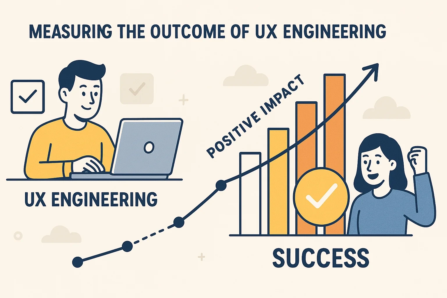
That was the moment it clicked: we didn't know how to measure what success looked like.
The mistakes that taught me the most
The first thing I learned? Measuring UX outcomes isn't about having answers. It's about knowing what questions to ask before you start changing things. And I hadn't been doing that.
At one point, we introduced a new onboarding flow we thought was intuitive. It turned out to be confusing in a new and different way. We were tracking time spent on the onboarding page and saw that people were staying longer, so we assumed that was good. They were lost.
We realized that "time on page" isn't always a measure of engagement. Sometimes people staying longer means they're struggling. So we started asking a different question: how fast can a new user get through this, and do they stick around afterward?
The awkward reality of "user success"
Another time, we launched a feature that got a lot of clicks. We thought it was a hit. But when we started gathering feedback, most users didn't even know what the feature was supposed to do. They kept clicking it trying to figure it out.
That was a hard lesson: a popular feature isn't necessarily a useful one.
We started combining usage data with small feedback prompts. Simple, honest questions: Was this helpful? Did this work the way you expected? Hearing from users in their own words changed how we worked. It stopped us from declaring victory too early.
Communicating metrics without losing the room
Once we got better at collecting meaningful data, we had to learn how to actually talk about it without putting people to sleep.
Telling stakeholders "bounce rate dropped by 15%" meant almost nothing. But when we said, "More people are sticking around because the new layout gives them more confidence in the product," that landed. Even better when we added, "We're seeing a 15% increase in signups because of it."
The more human we made the story, the more people cared. Because it's not about numbers for their own sake. It's about what those numbers mean for real users: how much easier it is for a parent to log a daily report in a childcare app, or how many fewer steps a small business owner takes to get insured.
Goalposts move, and so should your metrics
We also learned not to get too comfortable with any one metric. For a while, we obsessed over page load speed. We were convinced it was the biggest hurdle to user happiness. And it was.
Then, once we got performance where it needed to be, support tickets shifted from "this is slow" to "I don't understand what to do next." Comprehension had become the issue, not speed. So we changed what we measured.
Knowing when to let go of one metric and pick up another is part of the work.
What I know now that I didn't back then
I don't have a perfect system for measuring UX impact. I've shipped features without clear metrics. I've misread what the data was telling me. I've made assumptions that didn't hold up.
But over time, I've learned to slow down and ask better questions before starting a redesign. I've learned to pair analytics with real user feedback. And I've learned that the real win isn't making something look better. It's making it work better, in ways we can see and explain.
UX engineering isn't only about clean code and smooth animations. It's about outcomes and impact. The only way to know if we're getting it right is to measure, listen, and keep learning, even after launch.