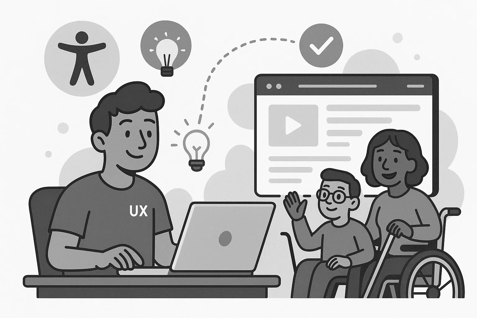
When I first heard people talking about "accessibility," it felt a little abstract, like one of those corporate checklist items that nobody really understood but everyone agreed we should probably care about. I knew it was important. I wanted to do the right thing. But early on, it honestly felt like extra work that slowed everything down. It took watching real users interact with real products for accessibility to finally click for me.
The wake-up call
The first wake-up call happened during a simple user test. We had built a fairly straightforward form: name, email, a couple of custom dropdowns (because the default select elements didn't match the design). Everything looked great. Felt clean. Everyone congratulated themselves at the design review.
Then someone couldn't complete the form using just a keyboard. People do that? Turns out, far more people navigate web pages with keyboards than we realized. The tab order was unpredictable because elements appeared in different orders at different breakpoints. Focus got trapped in odd places when the dropdowns opened. Some of them didn't open at all. Watching that made it impossible to think of accessibility as "extra work" ever again.
Small changes, real improvements
After that, the way I approached building interfaces shifted. It wasn't about chasing Web Content Accessibility Guidelines (WCAG) compliance for the sake of ticking a box. It was about making things genuinely easier, more intuitive, and more inclusive, without an asterisk. I enjoyed the new challenge of digging into the details that actually made a difference.
At first, I overdid it. That's probably normal with newfound zeal. I started adding Accessible Rich Internet Applications (ARIA) labels to everything as a default, not an afterthought. But I was building good habits. I stopped relying on placeholder text in form fields to communicate important instructions. I made sure every component we shipped worked for keyboard users before worrying about swipe gestures and hover states. And though I didn't have a dedicated screen reader at my disposal, I started testing with VoiceOver and NonVisual Desktop Access (NVDA) whenever I could. I learned a lot about how people actually used our interfaces.
None of it felt flashy. Nobody ever commented, "Wow, look at that beautifully coded aria-describedby attribute!" But people completed tasks faster. Fewer users dropped off in frustration. Support tickets for basic usability problems started to fall. And the code just felt cleaner. When you build something accessible, you usually build it better for everyone, including other developers.
Why it's part of craftsmanship
Accessibility still gets thrown around as a buzzword sometimes. It's easy to promise. It's harder to weave into day-to-day development when deadlines are tight and scope is creeping. I get it. I've been there too.
But it's not some heroic extra feature you bolt on at the end. It's just part of making good software. Accessibility work isn't about being perfect. It's about caring enough to notice the small things. It's about choosing to make your work usable for more people, even when no one's holding you accountable for it.
Once I started seeing it that way, I couldn't unsee it.