Overview
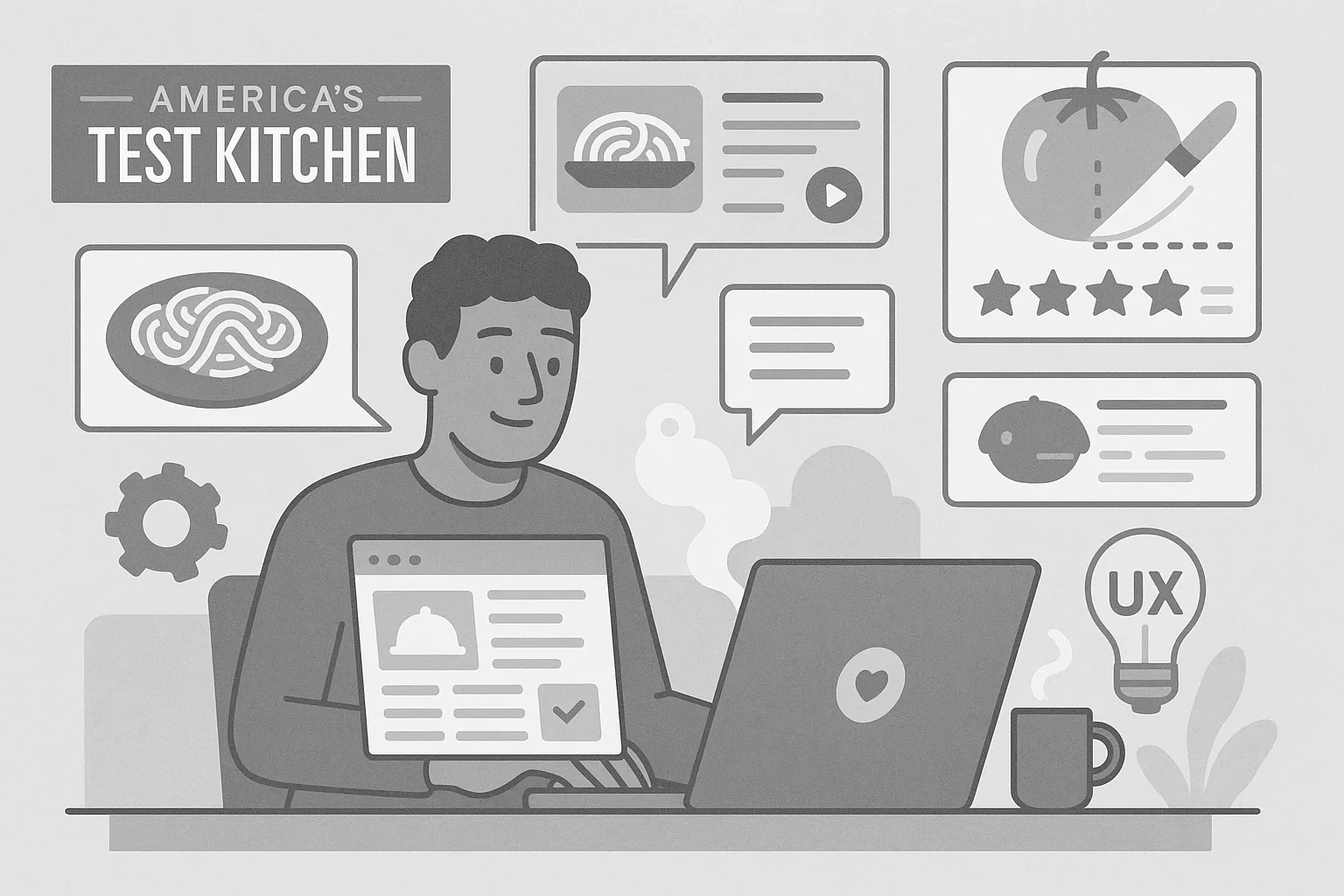
America's Test Kitchen (ATK) produces recipes, cooking guides, and product reviews across multiple brands, publications, and websites. When I joined the team, the engineering and editorial workflows were tightly coupled in ways that slowed content delivery and made cross-brand consistency hard to maintain.
My work focused on two areas: improving an existing content management system (CMS) for the editorial team, and creating a shared React component library that worked across ATK's brand portfolio.
Rehabilitating Barista, ATK's custom CMS
The problem
Barista was built by back-end developers and launched without accessibility or editorial usability in mind. There were no reusable components, no consistent interaction patterns, and no involvement from the people who would use it daily. The interface was difficult for the editorial team to navigate, and the experience showed it.
I was re-hired specifically to address these issues. My mandate was to make Barista accessible and usable by working directly with the editorial team to understand where the interface was failing them.
My role
I started by talking to editors, project managers, and content leads to map the actual friction in their day-to-day workflows. The problems weren't subtle: navigation labels didn't match editorial language, template selection was unpredictable, and the interface had no accessibility baseline.
From there, I made targeted changes. I reorganized the navigation, renamed options to reflect how editors actually talked about their work, and made template selection more consistent and predictable. Across the interface, I introduced reusable component patterns where previously everything had been built one-off.
The result
The editorial team went from working around Barista to working with it. Content that had required workarounds or tribal knowledge became straightforward. Feedback sessions that had surfaced frustration started surfacing smaller, more specific requests instead.
Accessibility as remediation
Barista launched without an accessibility baseline. Keyboard navigation was incomplete, heading structure was inconsistent, and color contrast fell short of acceptable thresholds.
I worked alongside QA testers and accessibility specialists to audit the platform and address issues as they were identified. The audit covered color contrast ratios, heading hierarchy, keyboard navigation across all interactions, and screen reader compatibility.
The remediation brought Barista to Web Content Accessibility Guidelines (WCAG) 2.1 AA standards and made the tool usable by team members with a range of abilities and assistive technology preferences.
A shared component library across ATK's brand portfolio
The problem
ATK operates several brands, each with its own visual identity, but the underlying UI patterns and interactions needed to work consistently across all of them. Building and maintaining separate component implementations for each brand wasn't sustainable.
What I built
Working with the design and marketing teams, I built a shared React component library using Next.js. The library covered a full range of UI elements: buttons, form inputs, carousels, modals with focus trapping, navigation patterns, and more.
The key architectural decision was separating visual styling from component behavior. Each component handled its own logic and accessibility requirements. Visual customization happened at the brand level through design tokens and style overrides. This meant a component built once could look and feel distinct across brands while sharing the same accessible, tested foundation.
The result
New features no longer had to be rebuilt from scratch for each brand. The team built once and styled as needed. Visual inconsistencies like mismatched colors or missing button states were easy to identify and fix in one place, and the fix propagated across all brands automatically.
Storybook documentation for the whole team
As the component library grew, discoverability became a challenge. Teams needed a reliable reference for understanding what each component did, when to use it, and what accessibility requirements applied.
I worked with QA and other engineers to document every component in Storybook. Each entry included a description of the component's purpose, usage guidance, variant examples, and accessibility notes.
The documentation wasn't written for developers alone. Designers used it to verify that implementations matched their intentions. Marketing and content teams used it to understand what was available before requesting new work. A shared, accessible reference reduced miscommunication across disciplines and made onboarding new team members faster.
What I took from this project
The work at ATK reinforced what happens when teams build technical tools without involving the people who will use them. Barista wasn't broken because of bad intentions. It was built by back-end developers who were focused on what the system could do, not on how editors would experience it day to day.
Fixing that required conversations before code. Understanding what editors actually needed, in their language, shaped every decision about navigation, naming, and structure. The component library followed the same principle: documenting it for a cross-functional audience made it more useful than if it had been written for developers alone. Good systems are built with the people who use them, not just for them.