
Case study
One component library, many brands, no fragmenting.
Improving an inaccessible CMS and building a shared React + Next.js component library for one of the most recognized cooking brands in the US.
Plate 01
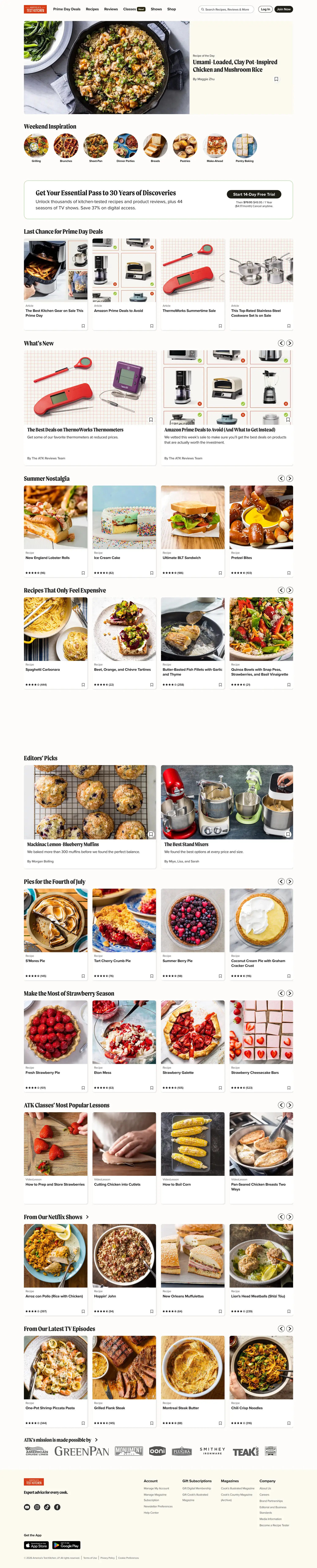
The live site, full page: scroll the frame to walk it top to bottom, or open it in a new tab.
Receipts
- Skills proven
-
- Design systems
- Accessible component APIs
- Multi-brand theming
- Frontend architecture
- Design-to-code
- Documentation
- Stack
-
- React
- Next.js
- TypeScript
- Storybook
- Design tokens
- CSS variables
- Quality
-
- Keyboard operability
- Focus management
- ARIA semantics
- Token contrast checks
- Outcomes
-
- Faster brand launches
- Consistent feature shipping
- Quicker onboarding
On the docket
- 01 The core architecture problem
- 02 Library decisions in practice
- 03 Accessibility across every surface
- 04 What it enables at scale
America's Test Kitchen operates across multiple editorial brands, each with its own visual identity, its own product team, and its own publishing cadence. The challenge isn't unique to ATK: when a single component library needs to serve multiple products that look different but share behavior, the architecture has to be built for that from the start. Libraries designed for one brand and retrofitted for others quickly accumulate the wrong kind of complexity. At ATK, I built a shared component library in React and Next.js that could serve multiple brand surfaces without requiring separate implementations for each one.
Step 01
The core architecture problem
A component library that serves multiple brands has two failure modes. The first is rigidity: the library is built for one brand, and every other brand works around it, producing inconsistency and parallel implementations. The second is fragmentation: the library tries to accommodate every brand's specifics directly, and the component API becomes so configurable that it stops enforcing anything.
The solution to both is a clean separation between behavior and appearance. Components own their behavior: keyboard navigation, focus management, ARIA attributes, interaction patterns. Visual styling is supplied through the token system, which each brand can configure independently. A modal behaves the same way across every brand. It looks different because the tokens it references resolve to different values depending on which brand context it's rendered in.
This isn't a novel approach. It's the approach that lets systems scale without fragmenting. The work is in executing it consistently across every component in the library.
Failure mode A
Too rigid
Built for one brand. Every other team works around it. Parallel implementations sprout in the margins.
Failure mode B
Too fragmented
Every brand's specifics baked into the API. The component stops enforcing anything and becomes a config soup.
Step 02
Library decisions in practice
Building the library for this architecture meant making specific decisions at every layer.
-
Brand-agnostic APIs
Props controlled behavior and content, not visual style. No
brandprop forking the render tree. Visual differences flowed through the token system instead. -
Complete token coverage
Every brand difference had to be expressible as a token value rather than a one-off override. Gaps always surface as CSS escape hatches, and that's how brand divergence accumulates.
-
Storybook as development + docs
Usage examples, variant coverage, and a11y notes were part of a component's definition of done, not something added afterward. An undocumented component gets used incorrectly or rebuilt by a team who couldn't find it.
// Button.tsx: one API, every ATK brand.
// No `brand` prop. Appearance resolves from the active token context.
export function Button({ variant = 'primary', ...props }: ButtonProps) {
return (
<button
className={styles[variant]} // classes read CSS-variable tokens
{...props} // behaviour + a11y pass straight through
/>
);
}
// Cook's Country and Cook's Illustrated render the *same* Button.
// It looks different only because its tokens resolve differently.A modal behaves the same way across every brand. It looks different because the tokens resolve differently depending on which brand context it's rendered in.
Step 03
Accessibility across every surface
A multi-brand component library has a compounding relationship with accessibility. A keyboard navigation gap in a shared component isn't one violation: it's the same violation across every product that consumes the library. That made the case for treating accessibility as an architectural concern, not something addressed per-brand or per-feature.
Keyboard operability, ARIA implementation, focus management in overlay components, and contrast against the token system's color values were requirements for every component, not optional enhancements. A developer using the library to build a feature got accessible behavior without having to implement it. That's the structural benefit of treating accessibility as a component-level concern.
Built-in, not bolted-on
- Full keyboard operability
- Focus management in overlays
- ARIA semantics on every component
- Contrast checked against tokens
Step 04
What a shared library enables at scale
The compounding return on a well-built shared component library shows up over time. New brand surfaces launch faster because the behavioral foundation already exists. The component API enforces the right patterns, so features ship consistently across brands. And because the documentation is accurate and the system is coherent, new engineers ramp up by reading it.
A shared library built on a weak architectural foundation multiplies its problems at the same rate it multiplies its value. Every brand surface that consumes it inherits the same structural gaps.
brands, one library
Cook's Country, Cook's Illustrated, ATK
brand-fork props
divergence lives in tokens, not the API
shared a11y baseline
raised once, inherited by every surface
Faster brand launches
Behavioral foundation is already there: new surfaces mostly wire up tokens.
Consistent feature shipping
The component API quietly enforces the right patterns for every team that uses it.
Quicker onboarding
New engineers learn the system by reading it, because the docs are part of done.
What Fran said

Fran Middleton
Chief Digital Officer · America's Test Kitchen
Josh built the component library that finally let our brands stop fighting in code. Cook's Country, Cook's Illustrated, and ATK all share the same primitives now: the visual difference comes from tokens, not parallel implementations. He raised the floor on accessibility for every team that touches the system.
Product engineering
When a product needs a system, I build that too.
One component library, three brands, and one accessibility floor every team inherits. Sometimes building the whole product means building the system underneath it, so the right output becomes the default for teams I'll never sit next to.