
Case study
One design system, covering the whole platform.
Building a custom design system for a growing direct-to-consumer insurance platform, from stakeholder alignment through component library, documentation, and cross-team adoption.
Plate 01
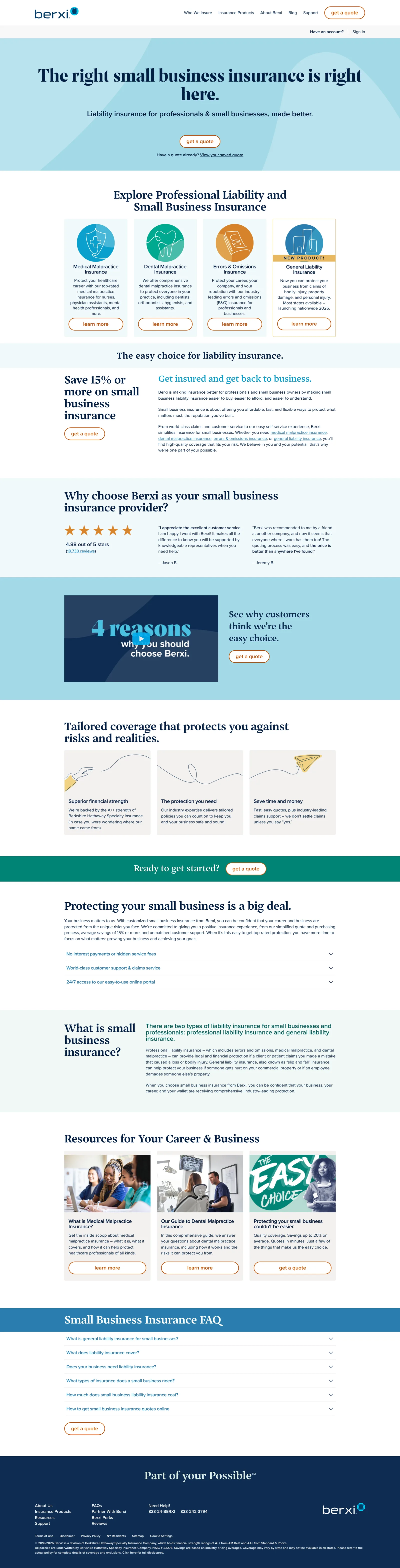
The live site, full page: scroll the frame to walk it top to bottom, or open it in a new tab.
Receipts
- Skills proven
-
- Design systems
- Accessible component APIs
- Frontend architecture
- Design-to-code
- Documentation
- Stack
-
- Vue
- Nuxt.js
- TypeScript
- Design tokens
- TailwindCSS
- Quality
-
- Keyboard operability
- Focus management
- ARIA semantics
- Token contrast checks
- Outcomes
-
- Faster brand launches
- Consistent feature shipping
- Quicker onboarding
On the docket
- 01 The drift problem
- 02 Two-tier token architecture
- 03 Accessibility as a system property
- 04 What the system changed
Berxi is a direct-to-consumer insurance platform built inside Berkshire Hathaway Specialty Insurance. The product was expanding quickly, and the frontend was expanding with it, but not in a coordinated way. Engineers were making design decisions independently across the codebase. Marketing wanted campaign flexibility they couldn't get. Engineering was burning cycles on visual work that should have been standardized. The job was to pull all of that together into a design system that the platform could actually grow on.
Step 01
The drift problem
Color values, spacing, and typography were defined locally inside individual components. Every new feature made another quiet decision about how things should look. With no shared token architecture, those decisions never rolled back up into a system. They just accumulated as subtle differences between pages.
The consequences showed up on two sides. Marketing couldn't run campaigns or build landing-page variations quickly because the existing surface wasn't flexible enough to extend without engineering. And engineers kept rebuilding visual primitives slightly differently each time, which is how a growing codebase starts paying a drift tax on every new feature.
Before writing any components, the work was alignment. Getting product, design, marketing, and engineering to agree on a single source of truth so the system we built would actually be the system the platform used.
Symptom A
Local decisions, global drift
Color, spacing, and type defined inside components. Every new feature quietly disagreed with the last one.
Symptom B
Marketing blocked on engineering
Campaigns and landing-page variations needed developer time that engineering didn't have to give.
Step 02
A two-tier token architecture
Tailwind gave us a utility-first model, expressive but constrained, and Vue's component model cleanly separated accessibility behavior from styling. On top of that, I built a token system in two layers so brand changes could propagate automatically without rewriting components.
-
Primitive tokens
The raw palette: colors, spacing steps, type sizes. No meaning attached, just values. This is what brand owns.
-
Semantic tokens
Role-based values: interactive element color, label-to-input spacing, body copy size. Components only ever referenced these, never the primitives directly.
-
Automatic propagation
A brand update changes a primitive. Every semantic token resolves to the new value. Every component using that semantic updates automatically. Nothing to hunt down.
The clearest signal that a design system is working is that it stops generating the friction that prompted building it.
Step 03
Accessibility as a system property
Accessibility requirements were built into each component from the start: keyboard navigation, ARIA attributes, focus management in overlays, color contrast against the token palette. These were properties the components already had, not a checklist feature teams ran afterward.
This matters more as a system grows. An accessibility gap in a shared component isn't one gap. It's the same gap across every feature that uses the component. Building accessibility in at the system level meant every feature team shipped accessible UI without having to implement it.
Built-in, not bolted-on
- Full keyboard operability
- Focus management in overlays
- ARIA semantics on every component
- Contrast checked against tokens
Step 04
What the system changed
Once the system was in place, the friction that had originally prompted the project stopped showing up. Marketing could run campaigns and build landing-page variations without waiting on engineering. Brand updates propagated automatically. Late-cycle visual inconsistency, the kind that used to get caught in review and ship anyway, stopped appearing, because the components no longer let you drift.
New engineers came up to speed faster because the library's API was consistent and documented, and because you could learn the system by reading it. The component library stopped being a source of ongoing debate and became part of the platform's quiet infrastructure.
Marketing unblocked
Campaigns and landing pages shipped without an engineering dependency in the critical path.
Brand updates propagate
Change a primitive and every component using that semantic token follows. No manual sweep required.
Faster onboarding
New engineers learn the system by reading it, because the documented component API is the system.
What Adam said

Adam Yasan
Managing Director · Berxi
Josh joined when our frontend was making the same decision in a hundred different places. He brought stakeholders into one room, set the token architecture, and shipped a design system the platform actually uses. Marketing got the campaign flexibility they'd been asking for, and engineering stopped reinventing the same components.
Product engineering
A foundation a whole team can build on.
Tokens, core components, accessibility baked in, and documentation cross-team partners can actually find, from stakeholder alignment through adoption. This is how I build: a product layer that holds up as more teams build on it.