Overview
Building Your Own Component Library is a 13-chapter guide to building a React component library from scratch. It covers everything: architectural decisions, a three-tier token system, intrinsic layout primitives, accessible UI components, Storybook documentation, testing with axe-core, and publishing to npm.
Rudiment UI is the library built alongside the guide. It follows the same patterns used by HeroUI and Untitled UI React, and its source is available on GitHub as a reference implementation. It's not the product. It's the proof that the approach in the guide works.
The guide as a teaching resource
Most tutorials show you what to build. This guide focuses on why each decision is made, and what happens later if you make a different one.
The guide is opinionated by design. It commits to a specific stack (React 19, TypeScript, Tailwind CSS 4, Vite, React Aria, Style Dictionary v4, Storybook 10, Vitest) and explains the reasoning at each step. Where reasonable alternatives exist, it names them and describes the trade-offs. What it doesn't do is try to cover every possible approach, because that's how guides become unusable.
Chapter 1 contains no code. It covers the architectural decisions that determine the cost and complexity of everything that follows: how to structure tokens, which accessibility primitives layer to use, how to approach styling. Every chapter builds on those decisions. Skipping them means skipping the part that transfers.
Each chapter specifies the package versions it was written against. Build tools and package ecosystems change. Knowing the version context is what lets you adapt when something breaks.
Architecture before code
The most expensive mistakes in a component library are architectural. A bad token structure means renaming hundreds of references later. A wrong CSS strategy means rewriting every component's styles. An accessibility layer added retroactively always costs more than one built in from the start.
The guide commits to a specific set of choices before a single component is written:
The guide explains the reasoning behind each choice and notes reasonable alternatives. The point isn't that these are the only valid options. Making explicit decisions before writing code prevents the kind of drift that turns a component library into a patchwork system.
A three-tier token system
Most token systems define a color palette and reference those colors directly in components. That approach breaks as soon as you need a dark theme, a rebrand, or a second product that shares components but looks different.
The guide builds a three-tier architecture:
Tier 1 (global tokens) defines the raw palette. color.blue.500 is #3B82F6. It has no opinion about what that color is for.
Tier 2 (semantic tokens) assigns meaning. color.brand.primary references color.blue.500. When the brand changes to teal, you update one alias and every component that uses color.brand.primary changes with it.
Tier 3 (component tokens) scopes values to individual components. button.background.default references color.brand.primary. This tier is useful when a large system needs to change one component's behavior without affecting others.
Token files use the Design Tokens Community Group (DTCG) format, which reached its first stable release in October 2025 and has support from Figma, Tokens Studio, Penpot, and Style Dictionary. Style Dictionary v4 processes the token files and generates CSS custom properties. Tailwind's @theme inline directive maps those properties to utility classes. Change a value in tokens.json, run build:tokens, and every utility class that references that token updates automatically.
Layout as a first-class concern
Most component libraries stop at UI components and leave layout to the consumer, who either writes custom CSS for every page or copies templates and strips out what they don't need.
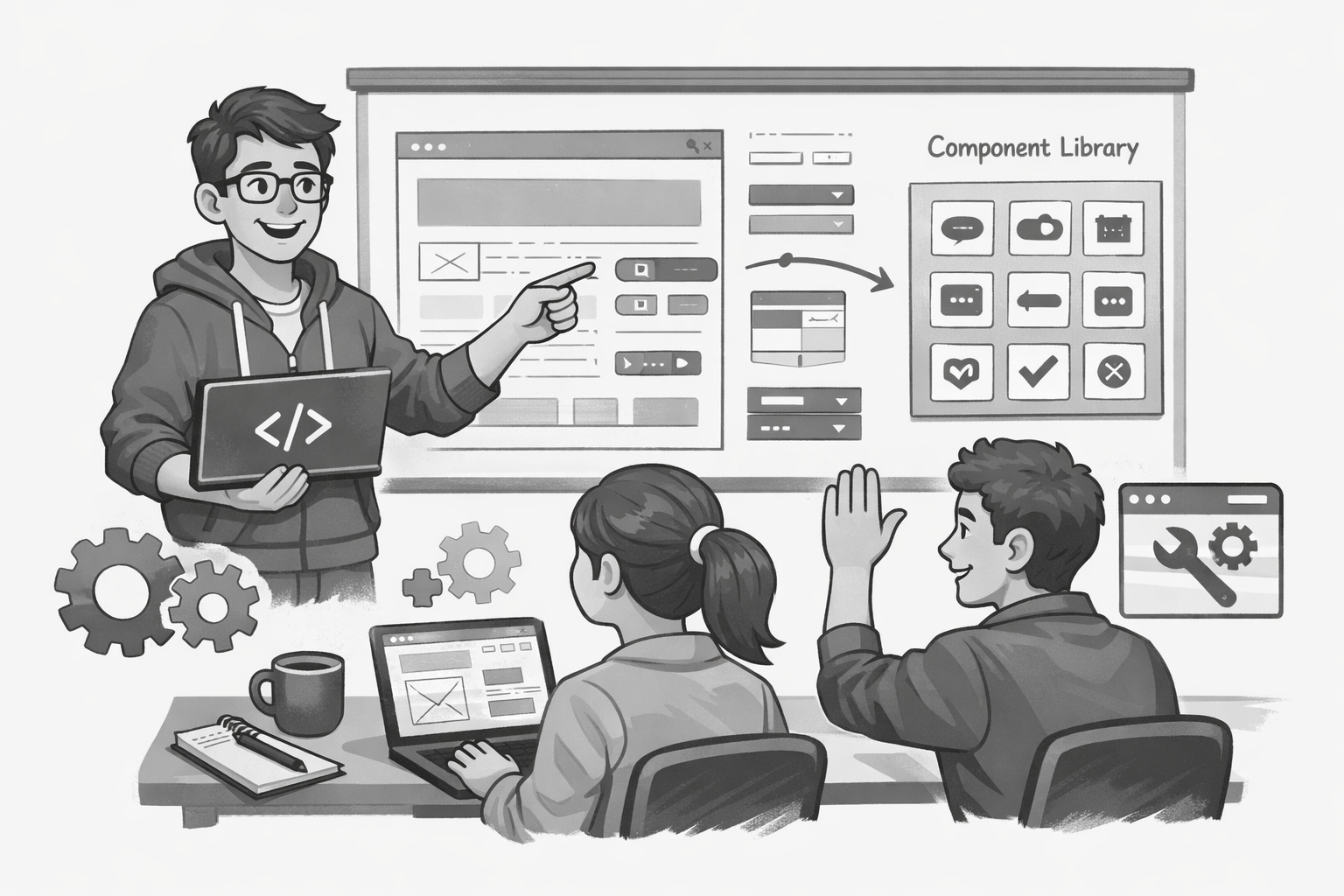
The guide treats layout as part of the library. It walks through building eight layout primitives (Stack, Box, Center, Cluster, Sidebar, Switcher, Grid, and Cover) following the intrinsic design principles described in Every Layout by Heydon Pickering and Andy Bell. These primitives respond to their container's available space rather than the viewport width, so they work in any context without media query breakpoints.
Each primitive is driven by the same token system as the UI components. Changing layout.stack.space.default adjusts vertical rhythm globally. Changing layout.sidebar.width propagates to every Sidebar instance in the application.
Accessible components with React Aria
Interactive components (buttons, modals, selects, tabs) carry significant accessibility requirements. A correct modal alone requires focus trapping, scroll locking, Escape key handling, focus restoration on close, and aria-modal management. Building that correctly from scratch for every component is not a sustainable approach.
The guide uses React Aria, maintained by Adobe's design system team, for the accessibility primitives layer. React Aria handles keyboard navigation, focus management, Accessible Rich Internet Applications (ARIA) attributes, press event normalization across pointer types, and internationalization of ARIA labels. It provides deeper coverage than building from scratch, and its maintenance is tied to Adobe's own production needs through the Spectrum design system.
The component set covers form inputs (Button, Input, Select, Checkbox, RadioGroup, Switch), overlays (Dialog, Tooltip), and feedback patterns (Alert, Badge, Card, Tabs). React Aria supplies the accessible behavior. Tailwind CSS 4 supplies the visual layer. The two concerns stay separate throughout.
Testing the accessibility contract
Tests in a component library matter more than usual because a regression in one component affects every consumer. The test suite covers two categories of behavior.
Layout primitive tests verify that each component applies the correct CSS classes and custom properties. They check that props set inline styles, that omitted props defer to the CSS token fallback, and that the as prop changes the rendered element.
UI component tests verify the accessibility contract: keyboard activation, disabled and error states, focus behavior, loading state ARIA attributes, and the absence of axe-core violations. Every assertion uses accessible queries (getByRole, getByText) or ARIA attributes. No test queries by CSS class name or internal DOM structure. Refactoring a component's markup doesn't break the tests as long as the behavior and accessibility contract are preserved.
Every component passes a toHaveNoViolations() check from vitest-axe. Full coverage of accessible behavior is more valuable than full line coverage.
Storybook as the documentation layer
As a component library grows, discoverability becomes a challenge. The guide configures Storybook 10 as the documentation layer, with story files for every component.
Each entry includes the component's purpose, variant examples, and the accessibility notes that apply. A kitchen sink page renders every component together in a single view, which makes visual regressions easy to catch and gives consumers a quick reference for what's available.
Packaging for distribution
The guide covers the full distribution cycle: configure Vite's library mode to produce a clean dist/ output with separate entry points for the component library and the token files, define package exports, add a prepublish script that runs token generation before the component build, and publish with npm publish. The package is versioned using conventional commits.
What I took from this project
Building a component library is as much an exercise in sequencing decisions as it is in writing components. The token architecture shapes every component. The component architecture shapes the test patterns. The test patterns shape what documentation needs to explain.
Documenting the reasoning alongside the implementation is what makes a library transferable. A repository without explanation gives you a working system. Explaining the trade-offs at each step gives you the judgment to extend it.