
Case study
A Rails shell, rebuilt for 2026.
A shell redesign for VMSpark, the multi-tenant pipeline that normalizes thousands of VMS jobs a day and fans them out to a dozen+ ATS providers, raising the visual caliber of the admin app without touching the pipeline underneath.

Receipts
- Skills proven
-
- CRUD Development
- Accessible component APIs
- Frontend architecture
- UI/UX Design
- Style Guide Documentation
- Training
- Stack
-
- Ruby on Rails
- Stimulus.js
- Design tokens
- Modern CSS
- Quality
-
- Keyboard operability
- Focus management
- ARIA semantics
- Token contrast checks
- Outcomes
-
- Increase in sales conversion
- Increase customer retention
- Increase usage by existing customers
On the docket
VMSpark normalizes thousands of VMS job listings a day, runs them through an account-specific rule engine, and fans them out to whichever ATS the customer has contracted with. The product works. The shell it lived in did not look like it. Leadership was scheduling investor demos, and the admin app, the surface those conversations lived inside, felt like a Rails scaffold from 2018. Operators noticed it daily. Investors noticed it in the first thirty seconds of a demo.
The brief I gave myself: make the shell read as a modern, enterprise-grade product that matches the sophistication of the pipeline underneath, without touching the pipeline, the rule engine, or anything an operator had muscle memory for.
Step 01
Inventory before invention
Before writing a line of new CSS, I cataloged what was there. The result was a ~700-line design inventory covering every one of the 350 ERB templates (roughly 11,800 lines) across the app.
The audit wasn't a complaint list. It was the map that told me which problems were cosmetic (fixable during the redesign), which were structural (needed architectural decisions), and which were out of scope (pipeline-adjacent, don't touch). Most of what I found was UI sprawl: the same interaction rendered a dozen different ways across the app, each screen a small argument against the one before it.
ERB templates inventoried
button styles, one concept
form-element styles
views bypassing the tokens
A few of the findings
Button styles competing for attention
Primary, secondary, danger, and ghost variants, each implemented two or three different ways. Some leaned on Bootstrap utility classes, others on per-view custom CSS, a few were inline-styled anchors pretending to be buttons. A Save on one screen didn’t match a Save two clicks away.
Form element styles, all at once
Plain Rails helpers sat next to Bootstrap form-control inputs, Select2 widgets, and hand-rolled dropdowns. Border radius, padding, focus rings, and disabled treatments all diverged. The same concept (pick one from a list) rendered five different ways across the app.
Form-rendering patterns, coexisting
form_with(model:), legacy form_for, form_with(url:), bare <form> + HTMX, and HTMX-only with hx-include.
Tables with no shared convention
Row striping in some, not in others. Headers styled four ways: dark fill, light fill, borderless, and all-caps. Pagination rendered with Kaminari on one screen and a bespoke HTMX block on the next. Density jumped from compressed to roomy between adjacent views with no underlying logic.
Labeling strategies, all coexisting
Sentence case, Title Case, ALL CAPS, and placeholder-as-label all appeared across the app. Required indicators were sometimes asterisks, sometimes parenthetical (required), sometimes absent. The same field concept carried different names on different screens (Bill Rate, Rate, Pay Rate).
Views bypassing the token system
A semantic color-token system already existed in _color_tokens.scss, but dozens of views bypassed it with inline styles, hardcoded hex literals, and raw colors in view-level <style> blocks.
Dead code in production
A zero-byte _empty.html.erb, an X-prefixed dead index file (101 lines), an ASDKAJSHDJHASD debug string committed to production, and a sticky table header with hardcoded background-color: red from an abandoned debug session.
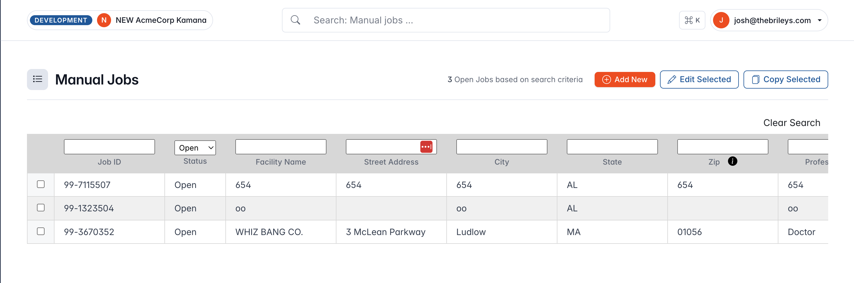
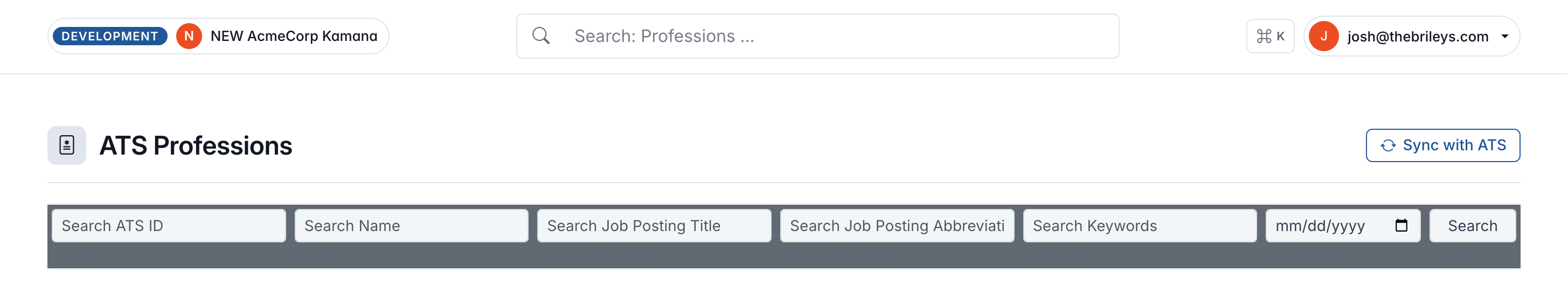
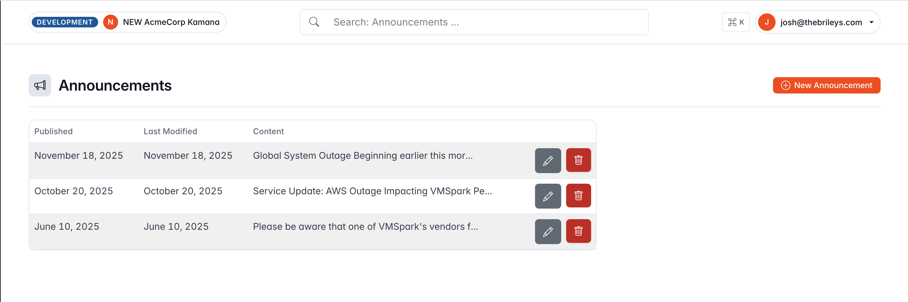
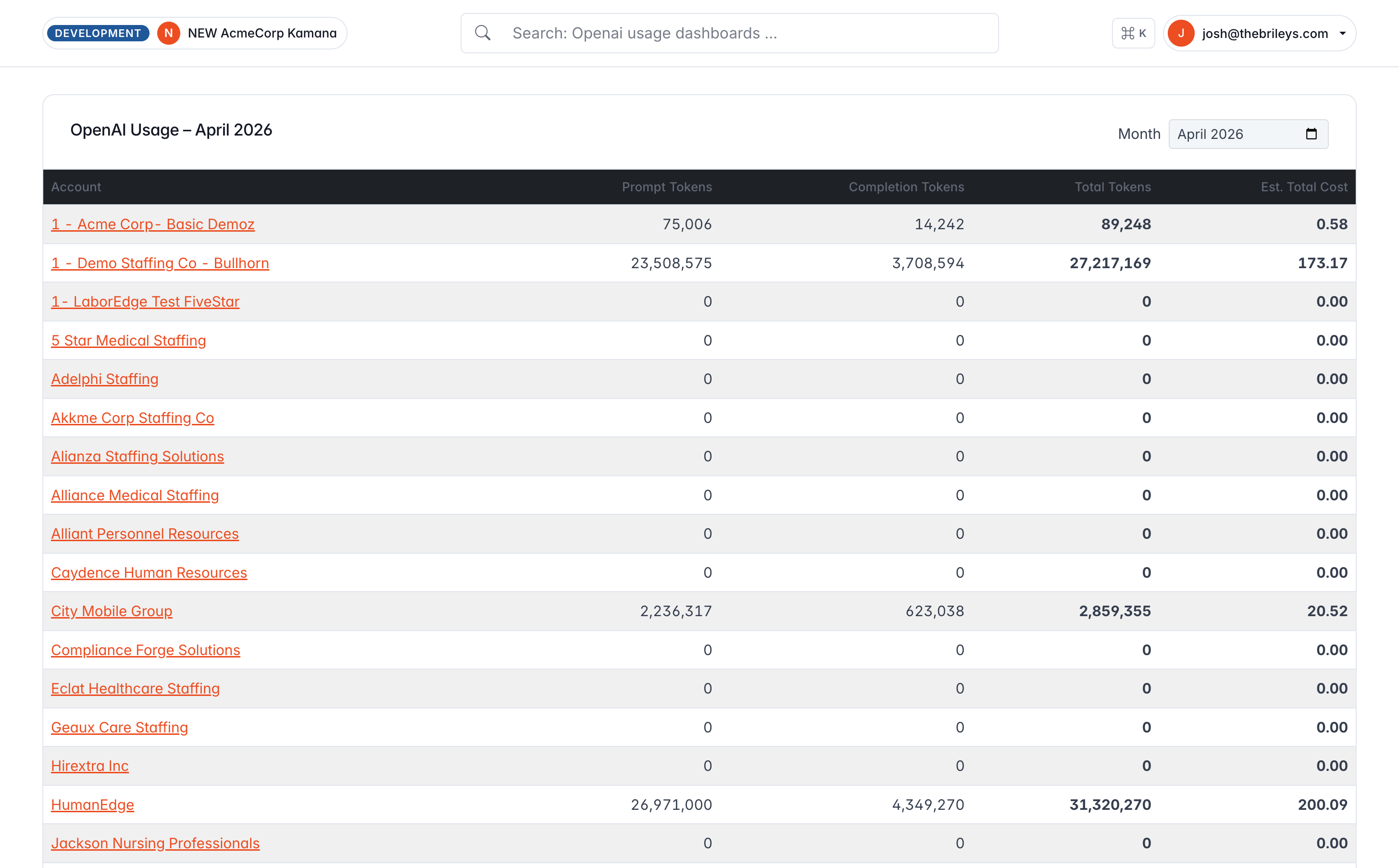
What the sprawl actually looked like
Four screens pulled from the same app, on the same day. Each one makes its own decisions about buttons, inputs, labels, and tables. None of them agree with the others.
With the inventory in hand, I could fix the UI sprawl at the root rather than one screen at a time. Buttons collapsed to a single set of component classes. Form inputs, selects, and labels moved onto shared primitives with consistent padding, focus states, and required-field treatment. Tables standardized on one header style, one pagination component, one density rule. Each fix cascaded across dozens of views because the semantic token layer was already in place. I just needed the views to route through it.
What it looks like now
The same surfaces, rebuilt onto one system: the admin UI playground every screen now inherits from. Scroll any frame to walk the full page.
Plate 01
The admin-only style guide: every primitive, button, table, and form pattern documented in one place.
Plate 02
Color, type, spacing, and elevation: the shared primitives every screen now draws from.
Plate 03
One header style, one density rule, one pagination component, standardized across every table.
Plate 04
Eight-plus button styles collapsed into a single set of component classes: every variant, size, and state.
Step 02
Three directions, one chosen
Rather than design in a vacuum, I spec'd three mutually exclusive directions with honest tradeoffs. Writing the options down, with their reasons and risks, is what lets the choice get overturned on evidence later, not preference.
Dense · Keyboard-first
56 px icon rail, tight 13/14 px type, hairline borders,
⌘K palette as the centerpiece,
orange reserved for exactly one thing per screen.
Signals “scales to power users.”
Chosen
Enterprise-familiar
48 px product rail plus 260 px project nav, the real two-tier pattern. App-switcher waffle, breadcrumbed page headers, right-side inspector panel. Brand orange on active rail state, soft navy-tinted elevation.
Every enterprise buyer has used this pattern before.
Spacious · Document-forward
270 px soft sidebar, no persistent top bar,
⌘K by shortcut only, generous spacing.
Risk: reads as lightweight for a dense ops tool.
I chose B. Not because it was the prettiest (C was), and not because it was the most sophisticated (A was). I chose it because the product's audience was multi-tenant operators, and the lowest-risk path to both user and investor trust was the pattern those operators had already used at every previous job.
I also dropped a feature I'd originally scoped in: a global "Create" button. Most creates in this product are feed-driven, not user-initiated. Adding one would have been copying a convention without earning it.
Pattern familiarity compounds trust faster than novelty does.
Step 03
Phased rollout
Each phase was shippable on its own, behind no flags, with the previous phase's work still intact if I needed to roll back.
Phase 1 · Baseline
Visual baseline
Built a _page_header partial and
page_header helper with
meta/tabs/actions slots, backfilled ~30 pages silently by having the legacy
partial delegate to the new helper. Added an environment/account badge in the
top bar, an explicit multi-tenant signal at a glance.
Phase 2 · The shell
Two-tier shell
Replaced a single always-expanded 300 px sidebar with a 56 px product rail + 280
px contextual panel keyed off
controller_name via a
SidebarHelper mapping.
Crucially:
server-rendered active state. No client JS decides which section is open on first paint.
Phase 3 · ⌘K
Command palette
A read-only
CommandSearchController#index
scoped to current_account,
grouped (Custom Rules, Rate Plans, Facilities, Accounts, Jump-to), debounced at
150 ms, rendered via a native
<dialog> with HTMX.
Deliberate constraint: the palette
does not replace per-page search.
It's additive.
Phase 4 · Polish
Density, shortcuts, inspector
- Density toggle persisted on the user record, read pre-paint from
<head>to avoid FOUC. - Shortcut overlay (
?) gated to skip when a form field has focus. - Inspector slide-over built with HTMX to match the rest of the app.
- Skeleton loader primitive honoring
prefers-reduced-motion.
Step 04
Outcome
The app now reads as the same caliber product it always was. The pipeline, the rule engine, the ATS integrations, the account scoping. None of that changed. A user who logged in the day of the cutover saw their data, their filters, their scroll position, and their workflows intact. They just saw them inside a shell that looks like it belongs in 2026.
That shift paid off on both sides of the business. Operators who spent every working day inside the tool stopped mentally filtering out visual noise: buttons, forms, tables, and labels finally behaved the same from screen to screen, which made the product feel deliberate and trustworthy rather than patched together. Leadership stopped apologizing for the admin UI in investor demos. The audit is what made that possible: a map of every inconsistency first, a disciplined fix second, confidence on both sides of the table third.
Zero pipeline regressions
No regressions reported against the ingest or fan-out paths after cutover.
Consumer confidence
Operators use a tool that looks like one product, not ten. The UI stopped fighting them at every screen.
Investor confidence
Demos open with the product, not with caveats about the surface it lives on.
No new JS on hot paths
Palette and inspector load on demand. First paint got lighter, not heavier.
A detail worth calling out
Aligning the app with the marketing site
Partway through Phase 2 I pulled the marketing site's
:root custom properties (five
brand colors, pinned) and re-pointed the app's semantic token layer at them. The
semantic layer didn't change shape; I re-pointed five values and added three new
tokens. Every existing consumer got the new look for free. Two non-obvious
behaviors made it across intentionally: primary button hover swaps orange to steel
blue rather than darkening, and link hover goes near-black instead of lighter,
both inherited from the marketing brand.
The shell is the surface operators use every day and the one investors see in a demo. The audit is what let me rebuild it without breaking the product underneath.
What Jon said

Jon Sturm
Director of Product & Customer Success · VMSpark
Josh inventoried 350 ERB templates before he wrote a line of new CSS, then turned that audit into a phased rollout we could ship behind no flags. The shell finally reads like the enterprise product the pipeline always was, and operators didn't lose a single piece of muscle memory in the move.
Product engineering
I rebuilt the whole platform, and shipped it without a flag.
Inventory first, architecture second, a rollout nobody has to be afraid of, and a product that makes the right output the default. This is how I build: the whole thing, from the data underneath to the UI on top, owned so it ships finished and stays that way.