beckit
Personal project · Mental health journalingTurning a looping thought into a few sentences you can question.
beckit is a private journal for thought records, a common exercise in cognitive behavioral therapy (CBT). I designed and built the guided entry, a library of thinking traps, and an Insights page that shows when a pattern tends to appear.
- My role
- Product design and full-stack development
- Owned
- Research, product decisions, design, Rails app, illustrations
- Team
- Solo project
- Built with
- Rails 8, Hotwire, Tailwind CSS, PostgreSQL, Kamal
- 5
- short steps per entryEach with one required answer
- 11
- thinking trapsEach with a drawing and test questions
Project summary.
Paper thought records work, but a stressful moment is the worst time to face a long form. My first version had the same problem: the new-entry form was nearly five phone screens tall, with Save 3,523 px down the page.
- The decision
- I split the entry into small steps that each need one answer and save as you go, so someone can write one sentence and finish later.
- The result
- Starting an entry takes one required field, unfinished entries resume where you stopped, and every entry ends with the feeling rated before and after.
Who it’s for
beckit is for people keeping thought records, a common exercise in cognitive behavioral therapy (CBT). Paper thought records work, but they’re easy to put off. The worksheet asks for a lot at once, and a stressful moment is the worst time to face a form.
A journal only works if you can be honest in it, so beckit is private: only your account can see your entries.
The name comes from Aaron Beck, the psychiatrist who developed cognitive therapy and first described many of the thinking traps the app is built around.
Research
Every finding so far comes from my own walkthroughs, browser measurements, and a review against usability heuristics, WCAG 2.2 and CBT practice. A walkthrough with sixty test entries found that the new-entry form was nearly five phone screens tall.
down the page to Save
on the first new-entry form
test entries
in the walkthrough that measured it
-
A five-screen form
The new-entry form asked for the title, date, place and person before anyone had written what they were feeling.
-
One feeling rating
The first version recorded one unnamed number before the reframe and nothing after, so people would never see “7 down to 4”.
-
Still felt like paperwork
Splitting the form into steps fixed its length, but early feedback was that it still felt like paperwork.
-
A broken privacy promise
Outside font services could see who used a mental-health journal, and sign-ins never expired on shared computers.
-
Insights too dense
A bar chart, a heatmap, a pairs list and two color-coded grids, with tooltips that only worked with a mouse.
Five short steps from the CBT method
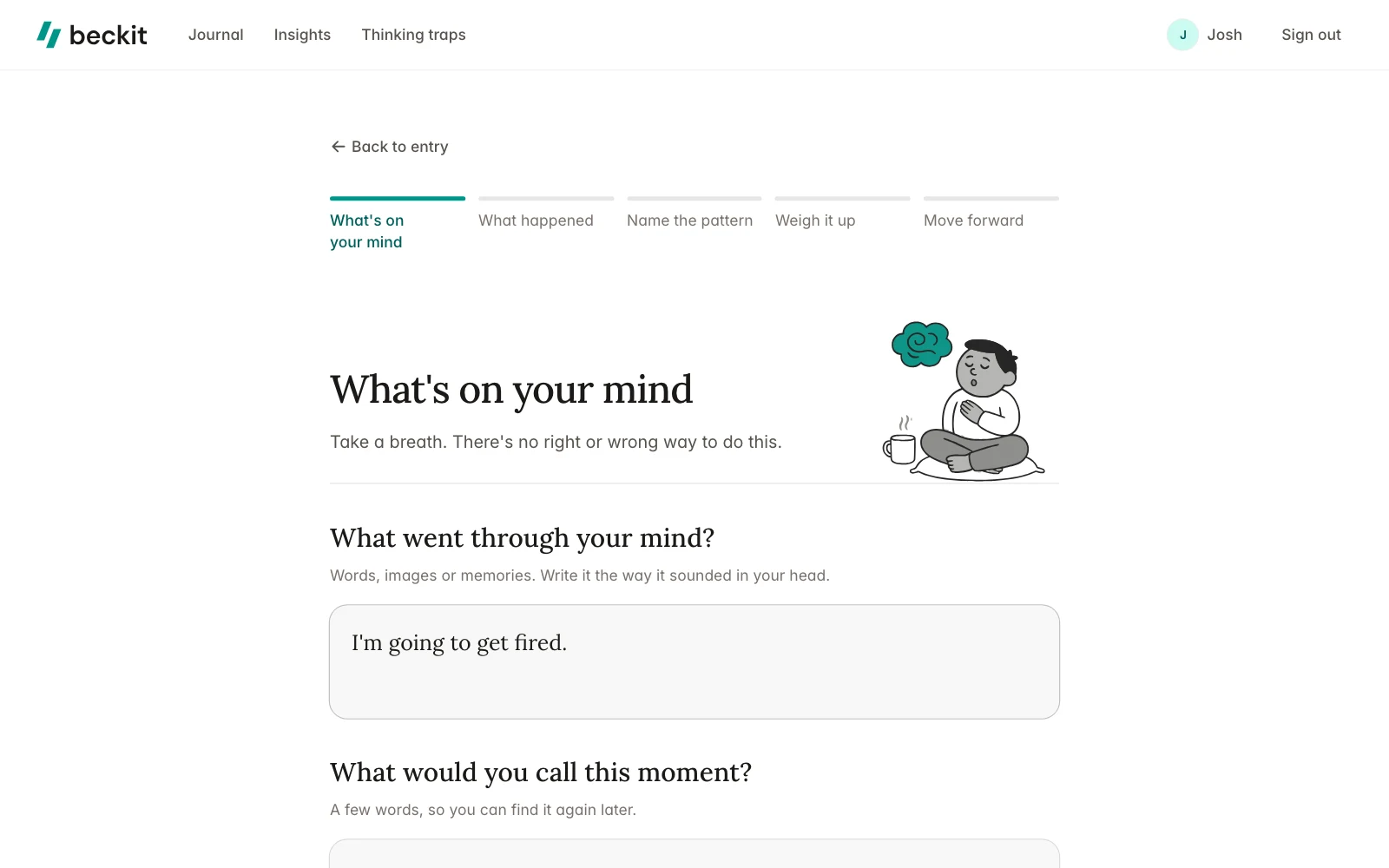
I chose to break the entry into small steps that each need only one answer and save as you go, instead of one long form that saves at the end. Someone can write a single sentence, close the app, and pick up where they left off later.
The steps follow how a CBT thought record is structured. My first version rated the feeling once, so people never saw “7 down to 4”, the moment that makes the exercise worth repeating. Now every entry ends with both ratings side by side.
-

What’s on your mind
The thought and a short name. The only step required before anything saves.
-

What happened
When, where, who, the feeling and its strength, and what you did. All optional.
-

Name the pattern
Pick the thinking traps that fit, with your thought shown above them.
-

Weigh it up
Evidence for and against, with questions from each trap you picked.
-

Move forward
A balanced thought, a second feeling rating, and a plan for next time.

Redrawn from the shipped screen.
-
 Name the pattern
Your thought stays in view while you pick traps.
-
 Weigh it up
Evidence for and against, side by side.
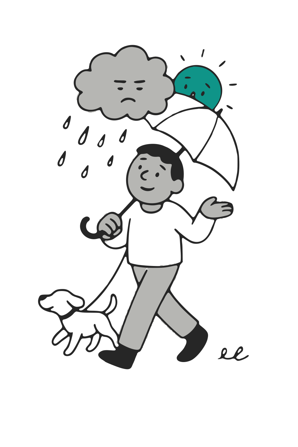
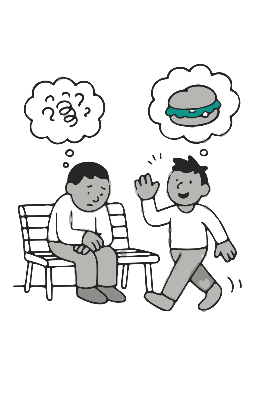
Each of the 11 traps has a page with a description, test questions, and an animated line drawing that also becomes its share image.
Drawings generated from a written style description drifted, so I generated each new one from the existing drawings and compared zoomed-in crops.
-

All-or-nothing thinking -
Overgeneralization -

Mental filter -

Disqualifying the positive -
Mind reading -
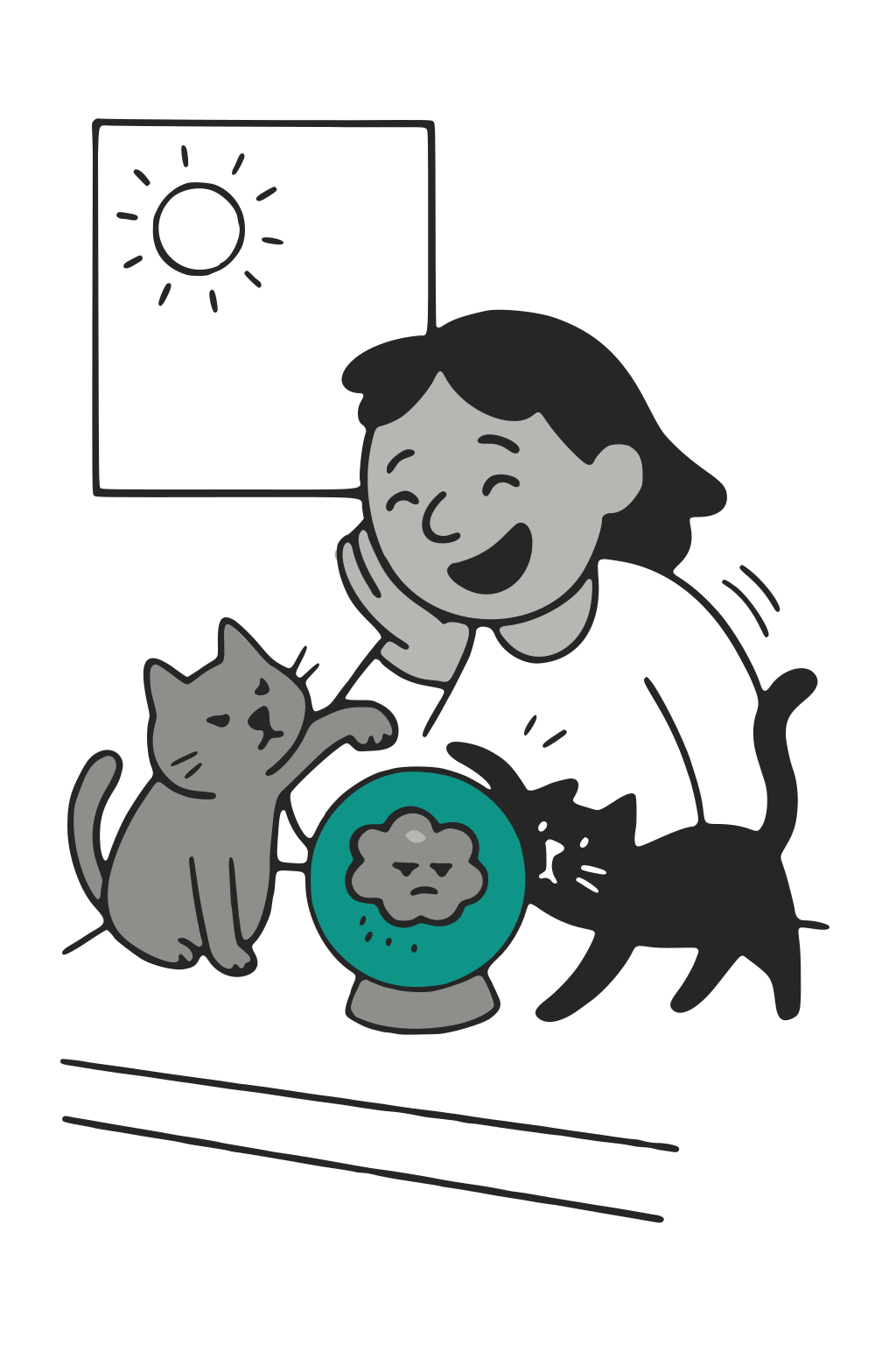
Fortune telling -

Catastrophizing -

Emotional reasoning -
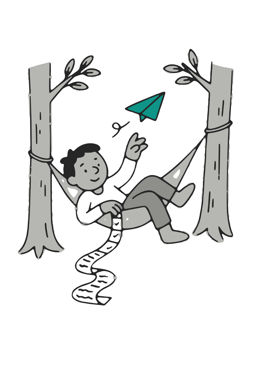
Should statements -

Labeling -

Personalization
One question at a time
Steps fixed the length, but early feedback said it still felt like paperwork. So questions now appear one at a time, worded the way a person would ask them.
I tried notebook-style ruled lines for the text areas, but they read as stray borders, so every field kept a visible box.
Details
- An intensity slider whose word and weather icon change as you drag
- A small hop from the step’s drawing when a question is answered, unless reduced motion is on
- The old thought fading into the balanced one on a finished entry
- “Jot it down for now” to save just the thought and return later
-
 A new entry
Only the first question shows.
-
 Move forward
The second feeling rating.

The feeling rated 7 before and 4 after.
Privacy gaps fixed as bugs
My review found the app broke its privacy promise: outside font services could see who used a mental-health journal, and sign-ins never expired on shared computers. I fixed each gap as a bug.
Controls
- Self-hosted fonts, images and logo, so no outside service sees a visit
- Sessions end when the browser closes unless you choose to stay signed in
- Unsaved drafts live only in the browser tab
- Deleted entries are restorable for 30 days, then gone
- Spreadsheet export with formula characters escaped
- Account deletion removes every entry, photo and sign-in immediately
- No service worker, so journal pages aren’t cached on the device
- A plain-language privacy page, a disclaimer, and a crisis line in the footer
Insights that describe patterns without interpreting them
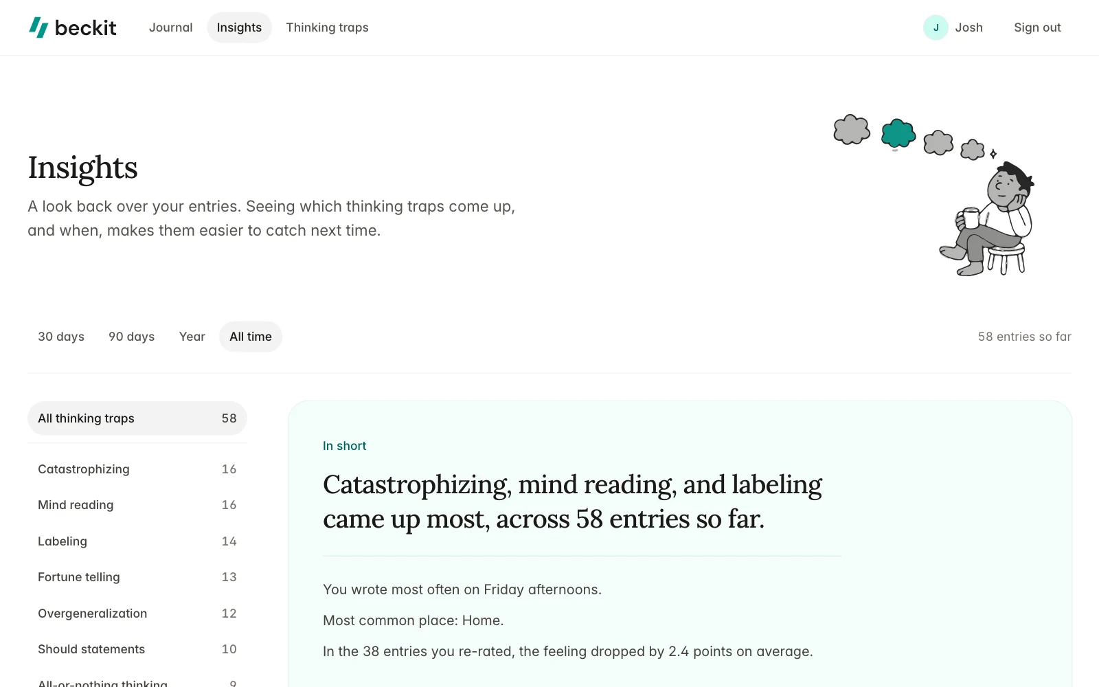
Insights describes which traps come up, and when, where and with whom, without interpreting them. Each comparison is against the person’s own usual rate: a trap counts as “more than usual” at a third above its overall rate, with at least three entries.
What Insights shows
- How often each trap comes up, by week
- A weekday-by-time-of-day heatmap
- Places and people where a trap shows up more than usual
- Traps that appear together
- How much the feeling changed between ratings
The first version was too dense and mouse-only. I added summary sentences, made every cell keyboard-reachable, and replaced the sideways-scrolling picker on phones.
-
 Insights overview
A summary sentence, then weekly counts and the heatmap.
-
 One trap
Mind reading against the person’s usual rate.
Results
Measured against my own review, not outside users.
required field to start an entry
down from a five-screen form
automated tests
models, step rules, Insights math and key flows
For people writing entries
- Starting an entry takes one question instead of a five-screen form
- Unfinished entries resume at the waiting step
- Every entry ends with a before-and-after feeling rating
- Entries are searchable, and the journal and Insights link to each other
- No outside service is contacted while someone writes
For the code
- One list of steps and required answers drives validation, navigation and the “Continue this entry” link
- Rate limiting on sign-in and sign-up
- A small set of shared Tailwind components with full dark mode
How it was built
Which answer each step needs lives in one place in the model. Step pages, navigation, validations and “Continue” links all read from it, and 220 tests cover the models, step rules, Insights math and key flows.
# app/models/situation.rb
class Situation < ApplicationRecord
# The entry form's pages, in order, each with the answers it needs before it saves. The first creates the entry.
REQUIRED_ANSWERS = { "whats-on-your-mind" => %i[ thought_imagery title ], "what-happened" => [],
"name-the-pattern" => %i[ distortion_ids ], "weigh-it-up" => [], "move-forward" => %i[ balanced_thought ] }.freeze
STEPS = REQUIRED_ANSWERS.keys.freeze
REQUIRED_ANSWERS.each { |step, attributes| validates(*attributes, presence: true, on: step.underscore.to_sym) if attributes.any? }
# The first step still waiting for its answer, or nil once every step has one.
def next_step = STEPS.find { !answered?(it) }
def complete? = next_step.nil?
# Steps open in order: any up to the first one still waiting for its answer.
def reachable?(step) = complete? || STEPS.index(step) <= STEPS.index(next_step)
endLimitations
Both of these come from building alone: I designed for people I haven’t watched use the app.
-
No user research yet
My own reviews catch broken things, not whether someone in a hard moment finishes an entry. I’d run five moderated sessions with made-up scenarios.
-
Not tested with screen reader users
One-question-at-a-time flows can hide context from screen readers, so that’s the first path I’d test. Dark mode and phone widths also got less checking.
More screens
The screens around the entry flow: the journal, the landing page, the thinking traps, and the privacy page.
See all 5 in the gallery