Case study
A component library,
built to be understood.
An open-source React component library paired with a 13-chapter guide that explains why each architectural decision is made, and what happens later if you make a different one.
Live stories / Storybook
The whole library, composed into real product surfaces.
Three complete surfaces (a sprint board, an analytics dashboard, and a storefront) assembled entirely from Rudiment primitives. These are the real Storybook stories: load one and click around.
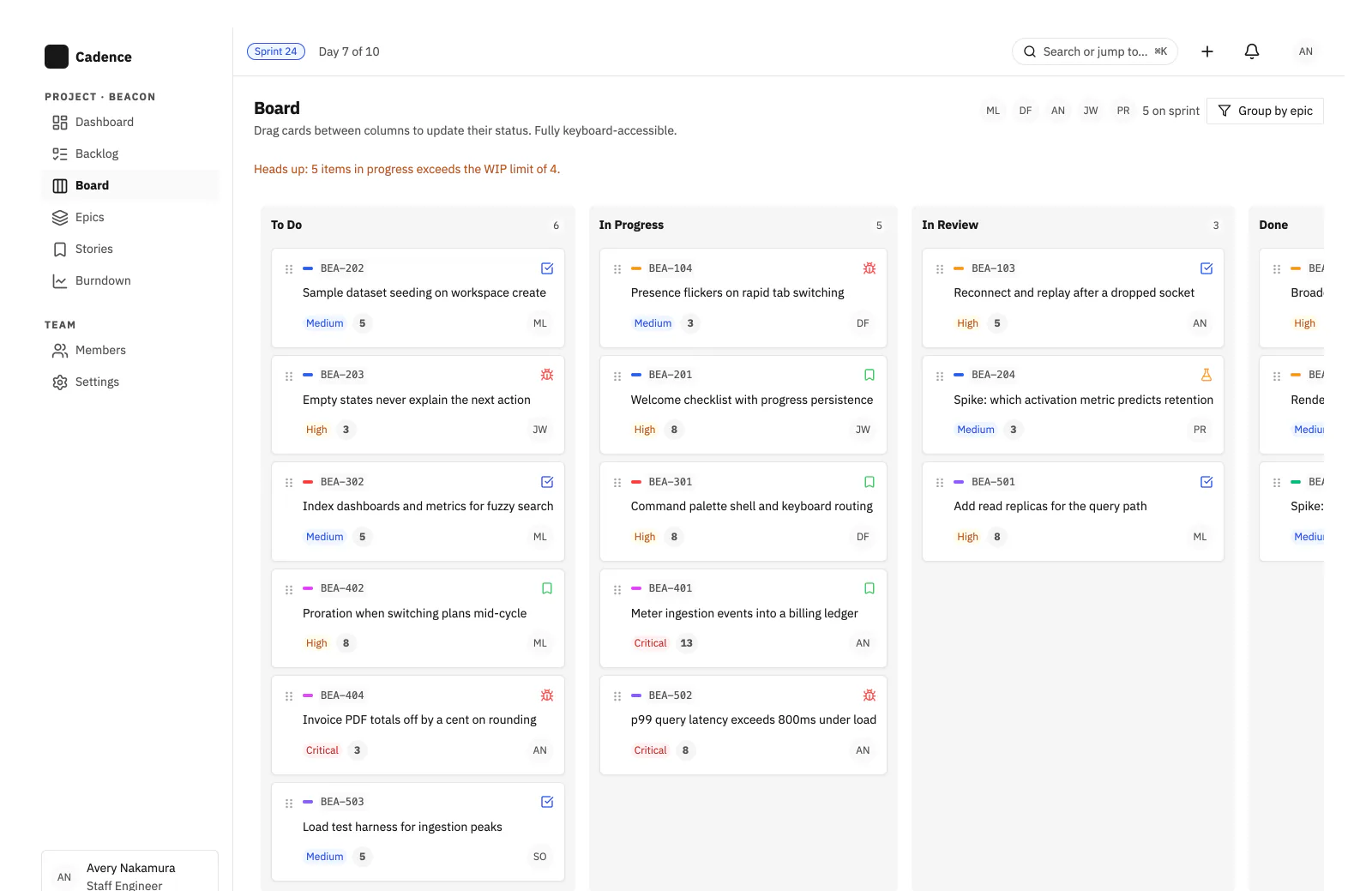
Project board
A Kanban board of draggable issue cards across four sprint columns, with WIP-limit warnings. Drag works by keyboard, not just pointer.
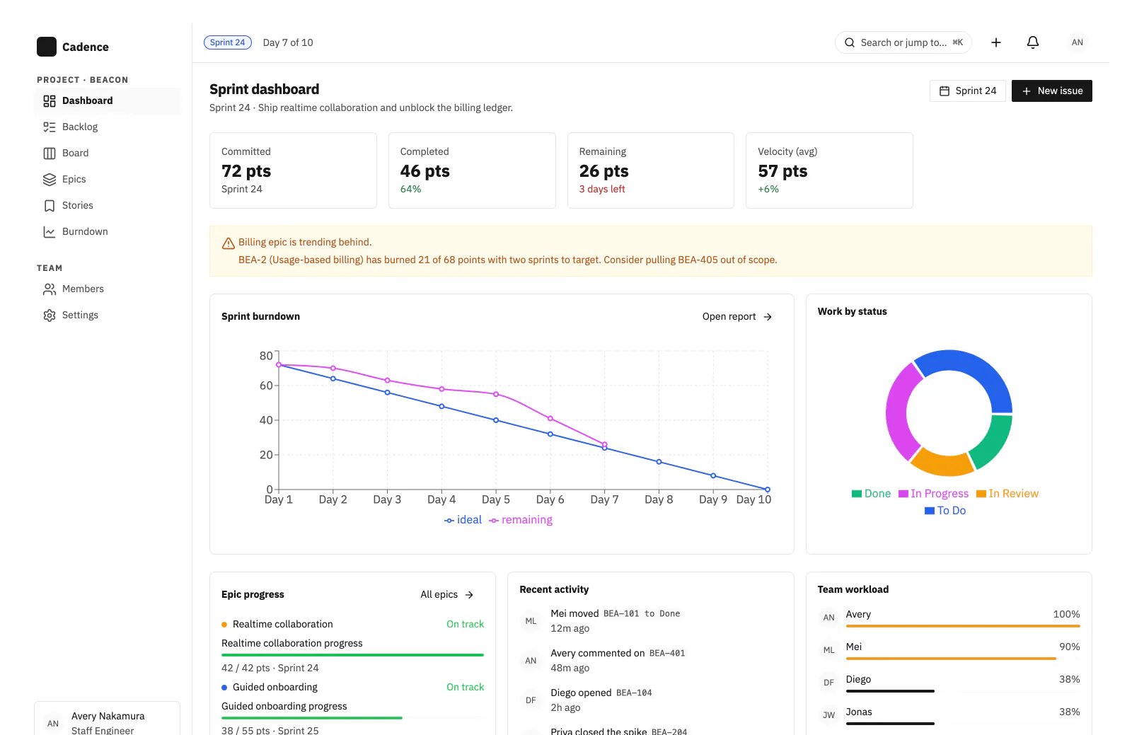
Sprint dashboard
The analytics surface: stat tiles, a burndown line chart, a work-by-status donut, and team workload meters.
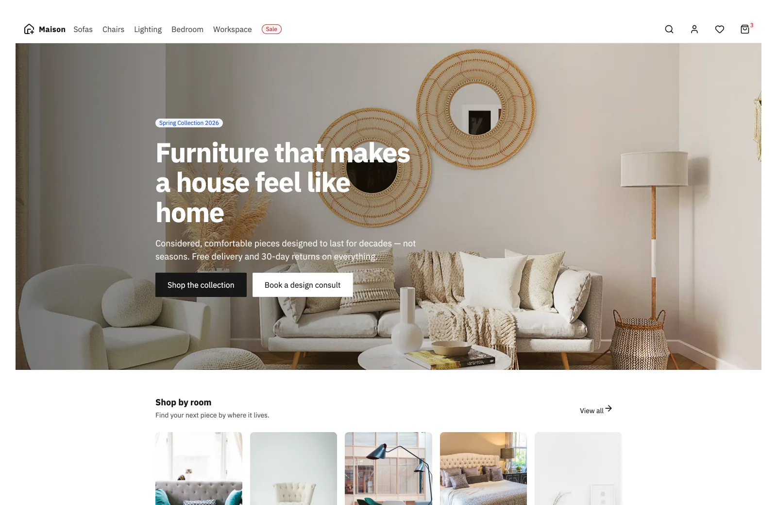
Ecommerce landing page
A marketing storefront: sticky navigation, a full-bleed hero, and a shop-by-room product grid.
Receipts
- Skills proven
-
- CRUD Development
- Accessible component APIs
- Frontend architecture
- UI/UX Design
- Style Guide Documentation
- Theming
- Stack
-
- React
- React Aria
- Storybook
- Design tokens
- Tailwind CSS 4
- Quality
-
- Keyboard operability
- Focus management
- ARIA semantics
- Token contrast checks
- Outcomes
-
- 13 shipped chapters
- 3 full example surfaces built from the library
- Two live deployed sites: guide + Storybook
On the docket
- 01 Why most libraries quietly fall apart
- 02 A three-tier token system
- 03 Accessibility as a contract
- 04 The thirteen chapters
- 05 See it served: guide & Storybook
Rudiment UI is a personal reference project, not a client deliverable, and that's the point. It exists because most of the component libraries I've been brought in to fix share the same root cause: architectural decisions that nobody wrote down, made in the wrong order, and now cost a quarter to untangle. Rudiment UI is the library I wish every team had started with, built deliberately, chapter by chapter, with the reasoning left in.
Step 01
Why most libraries quietly fall apart
Component libraries rarely fail loudly. They accumulate a thousand small compromises until the thing that once felt like a system feels like a patchwork. A missing semantic token layer turns a rebrand into hundreds of manual renames. An undecided styling strategy turns a refactor into a full rewrite. Accessibility bolted on after launch always costs more than accessibility designed in from day one.
Most of these mistakes aren't expensive because they were hard to avoid. They're expensive because they were made implicitly: in a stand-up, in a PR comment, in a hurried corner of someone's sprint. Rudiment UI starts from the opposite assumption: the structural decisions come first, with no code, and every choice gets written down alongside its consequences.
That's what the guide is. Chapter 1 contains no code at all. It's the conversation a team should have had before picking a CSS strategy.
The usual story
Drift, then debt
Tokens get added per-component. Styles leak into overrides. Documentation falls behind. The system stops being a system.
Rudiment's bet
Sequence on purpose
Token architecture shapes components. Components shape tests. Tests shape what the docs have to explain. Get the order right and the rest stops fighting you.
Step 02
A three-tier token system
Most token systems collapse because they try to do two jobs in one layer: hold raw values and express design intent. Rudiment separates those jobs across three tiers, each referencing the one beneath it. A brand change touches one file. A component tweak doesn't cascade into the rest of the library.
Global tokens · raw palette
Unopinionated primitives. No meaning, just values.
color.blue.500 = #3B82F6 Semantic tokens · assigned meaning
Aliases that encode intent. A rebrand touches this layer, not every component.
color.brand.primary → color.blue.500 Component tokens · scoped values
Narrow enough to tune one component without side effects elsewhere.
button.background.default → color.brand.primary Building a component library is as much an exercise in sequencing decisions as it is in writing components.
Token files use the Design Tokens Community Group format, flow
through Style Dictionary v4, and land in Tailwind CSS 4 via
@theme inline. Updating a single value propagates through every dependent
component: no hunt-and-replace, no orphans.
Step 03
Accessibility as a contract, not a checklist
A single interactive component can carry an enormous accessibility
surface. A modal alone needs focus trapping, scroll locking,
escape-key handling, focus restoration, and
aria-modal
management. Rudiment doesn't rebuild that for every component. It
leans on React Aria, maintained by Adobe's design system team, to
carry the behavior layer.
React Aria owns keyboard navigation, focus management, ARIA semantics, pointer normalization, and i18n. Tailwind CSS 4 handles the visuals. The two layers stay cleanly separated, which is what lets the library re-skin without touching any behavior.
Tests then lock in that separation. Layout primitives are verified against the tokens and classes they emit. UI components are verified against their accessibility contract: keyboard activation, disabled and error states, focus behavior, loading-state ARIA, and zero axe-core violations. Tests query by role and text, never by class name, so refactors don't silently break coverage.
Built-in, not bolted-on
- Full keyboard operability via React Aria
- Focus traps & restoration in overlays
- ARIA semantics on every component
- vitest-axe guards every test run
- Eight intrinsic layout primitives
- Contrast verified against token values
Step 04
Thirteen chapters, in order
The guide is sequenced deliberately. You can't make sensible component decisions until the token layer is settled. You can't write useful tests until the component API is stable. You can't publish confidently until the build workflow guarantees every tier stays in sync. Each chapter earns the next one.
- 01 Architectural decisions (no code)
- 02 Token system design
- 03 Styling strategy
- 04 Accessibility primitives
- 05 Layout primitives
- 06 Component patterns
- 07 Design tokens in DTCG format
- 08 Style Dictionary configuration
- 09 React Aria integration
- 10 Storybook documentation
- 11 Testing accessibility contracts
- 12 Build & packaging workflow
- 13 Publishing to npm
What reading the guide leaves you with
Judgment, not a template
Every decision is explained alongside the alternatives it closes off, so you can extend the system instead of copying it.
A working reference
An end-to-end library you can run, read, and pull pieces from: tokens, primitives, tests, publishing pipeline.
Debt you don't pay later
The expensive mistakes (shallow tokens, retrofitted a11y, drifting docs) get made visible before they compound.
A repository without explanation gives you a working system. Explaining the trade-offs at each step gives you the judgment to extend it.
Step 05
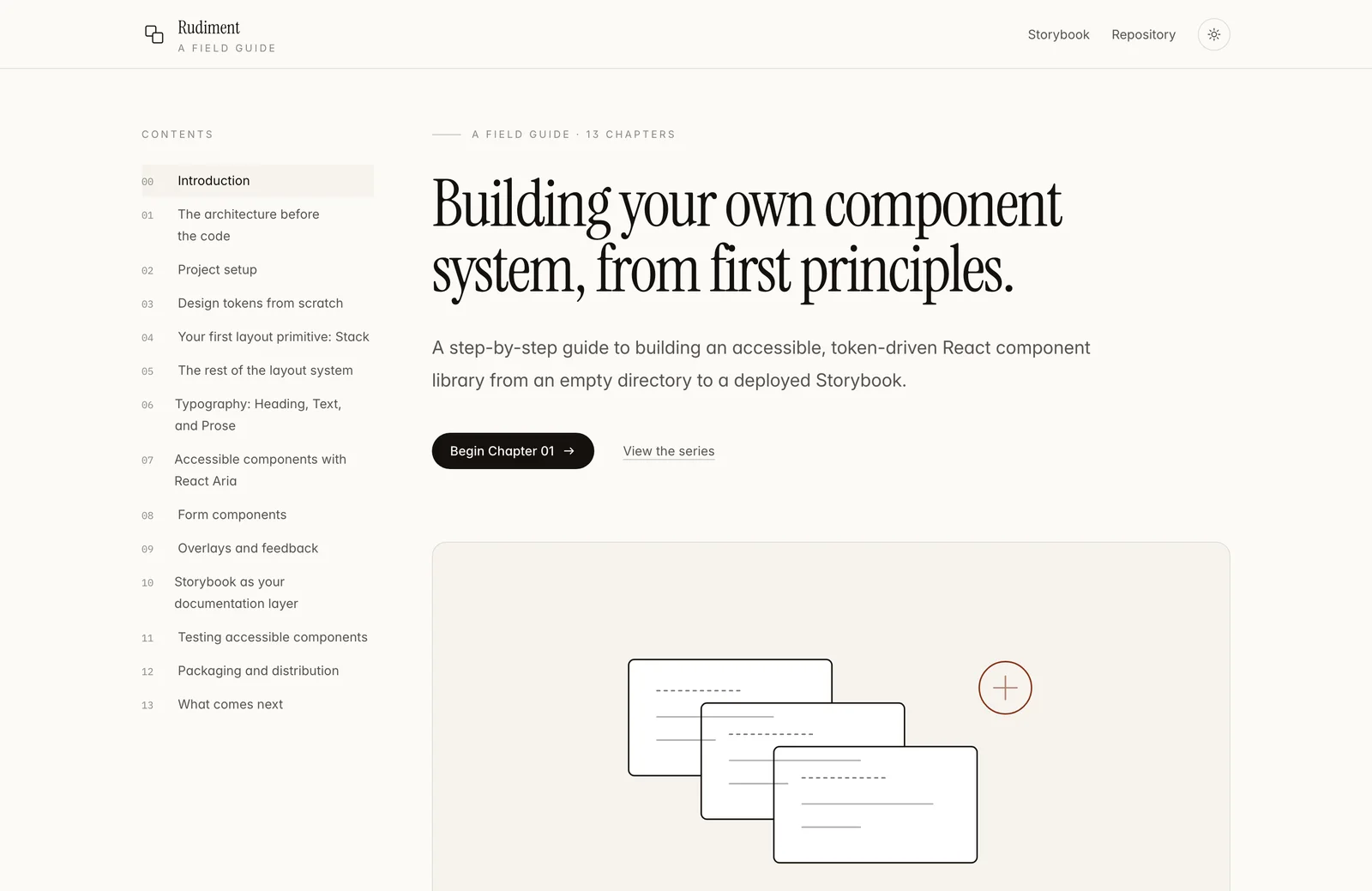
See it served: both halves, live
Rudiment ships as two deployed sites, and you can open both right now. The guide walks through the architectural decisions and trade-offs, chapter by chapter. The Storybook is the working library those decisions produced: every primitive, every component, every variant, in your browser.
The Rudiment Guide
rudiment-guide.netlify.app
A sequenced, decision-by-decision walkthrough: from an empty directory to a published, token-driven, accessible React library. Every choice is shown alongside the alternatives it closed off.
- Architecture, tokens, primitives, components, tests, publishing
- Companion GitHub repo with a complete working implementation
- The why behind each decision, not just the what
The Storybook
rudiment-ui.netlify.app
The deployed component library as an interactive reference: layout primitives, form controls, overlays, and every variant the guide produces, with controls and docs on each story.
- Live components built on React Aria & Tailwind CSS 4
- Token-driven theming visible across every story
- a11y & interaction addons wired in out of the box
Read a chapter, then open the matching story. The guide and the library are meant to be used side by side.
Product design engineering
A foundation that holds, built in public.
Rudiment UI is where I sharpen the engineering I bring to the products I ship: accessible-by-construction primitives, a three-tier token system, and docs treated as part of the artifact. The same care I bring to the whole product, end to end.